Notice: Undefined variable: post in /home/krooswyk/public_html/blog/wp-content/plugins/wp-tweet-button/wp-tweet-button.php on line 1224
Notice: Trying to get property 'ID' of non-object in /home/krooswyk/public_html/blog/wp-content/plugins/wp-tweet-button/wp-tweet-button.php on line 1224
Notice: Undefined index: in /home/krooswyk/public_html/blog/wp-content/plugins/wp-tweet-button/wp-tweet-button.php on line 1224
Is it the result of a botched marketing strategy, or an ingenious marketing ploy?
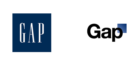
That is the hot question as the Gap brand has unveiled a new logo on their website. Yes, the iconic blue square with the simple, serif lettering has – gasp – been replaced. And not with something better. “Gap” now stands on its own in a black Helvetica font with upper and lowercase letters. The right edge of the letter “p” overlaps a small square with a blue gradient.
In an age where less is more and trendy often reigns over creative, their logo has retained its ability to “gap” the generations. It is elegant in it’s simplicity, and easily recognizable. If they move forward with this logo, it will be an affront to the brand. It may be new, but it’s already tired. It’s been done before, and it’s boring. There is nothing memorable about this Gap logo, and it is way too average for a store that claims to be anything but.
But all hope may not be lost. For better or worse, every brand loves attention, and the Gap is getting plenty of it (I’m no exception). The Gap is acknowledging this attention on their Facebook wall, and it’s possible this whole thing might just be a fantastic marketing tactic. Take a look:
“Thanks for everyone’s input on the new logo! We’ve had the same logo for 20+ years, and this is just one of the things we’re changing. We know this logo created a lot of buzz and we’re thrilled to see passionate debates unfolding! So much so we’re asking you to share your designs. We love our version, but we’d like to… see other ideas. Stay tuned for details in the next few days on this crowd sourcing project.”
Based on this, it appears that the Gap is offering an open design challenge to, well, everyone. With crowd sourcing all the rage these days, this is actually brilliant. They are going to receive hundreds if not thousands of submissions for logo ideas, all for free, and will only have to pay for the design they choose. This is a lot less costly than going to one firm (which will pinch them for being a large company) and spending tons of money working with them to achieve the desired look.
So, good luck Gap. It will be sad to see your iconic logo go the way of the dodo bird, but I have high hopes that this will be the start of a great new era!


I don’t get why they would change the logo. That would be like Coke changing the font on Coca-Cola. Bad move move Gap. Its been in place and worked for 20 years.
Agreed! Hopefully they can retain the style of the original, or just decide not to change it at all.